
Color Wheel Magic: Choosing Perfect Palettes for Portraits
Achieving Depth with Color Value
Using color value effectively can transform a flat painting into a lively, engaging piece. Selecting the right shades and transitioning smoothly between them is critical.
Highlighting and Shadowing
Incorporating highlights and shadows adds depth and dimension to portraits. Highlights occur where light directly strikes, while shadows form in areas receiving less light. Both can define the features and expressions of a subject, making details stand out prominently.
Adjustments in color value are crucial in this process. Lighter shades can create highlights that draw the eye and suggest texture, while darker shades in shadowed areas provide contrast. This interplay between light and dark tones helps convey more realistic and dynamic images, capturing the viewer’s attention.
Gradients and Transitions
Smooth gradients and transitions between colors ensure cohesiveness within a portrait. Artists must pay careful attention to how colors shift from light to dark. Techniques such as blending can create subtle gradations, vital for achieving a natural look.
Using a gradual change in color value allows for a seamless blend of highlights and shadows. These transitions prevent harsh boundaries, making artwork appear more fluid. Selecting the right hues for transitioning between light and dark areas helps convey depth without overwhelming the composition. Mastery of gradients enhances the visual flow and adds sophistication to any piece.
Mastering Color Schemes in Portraits
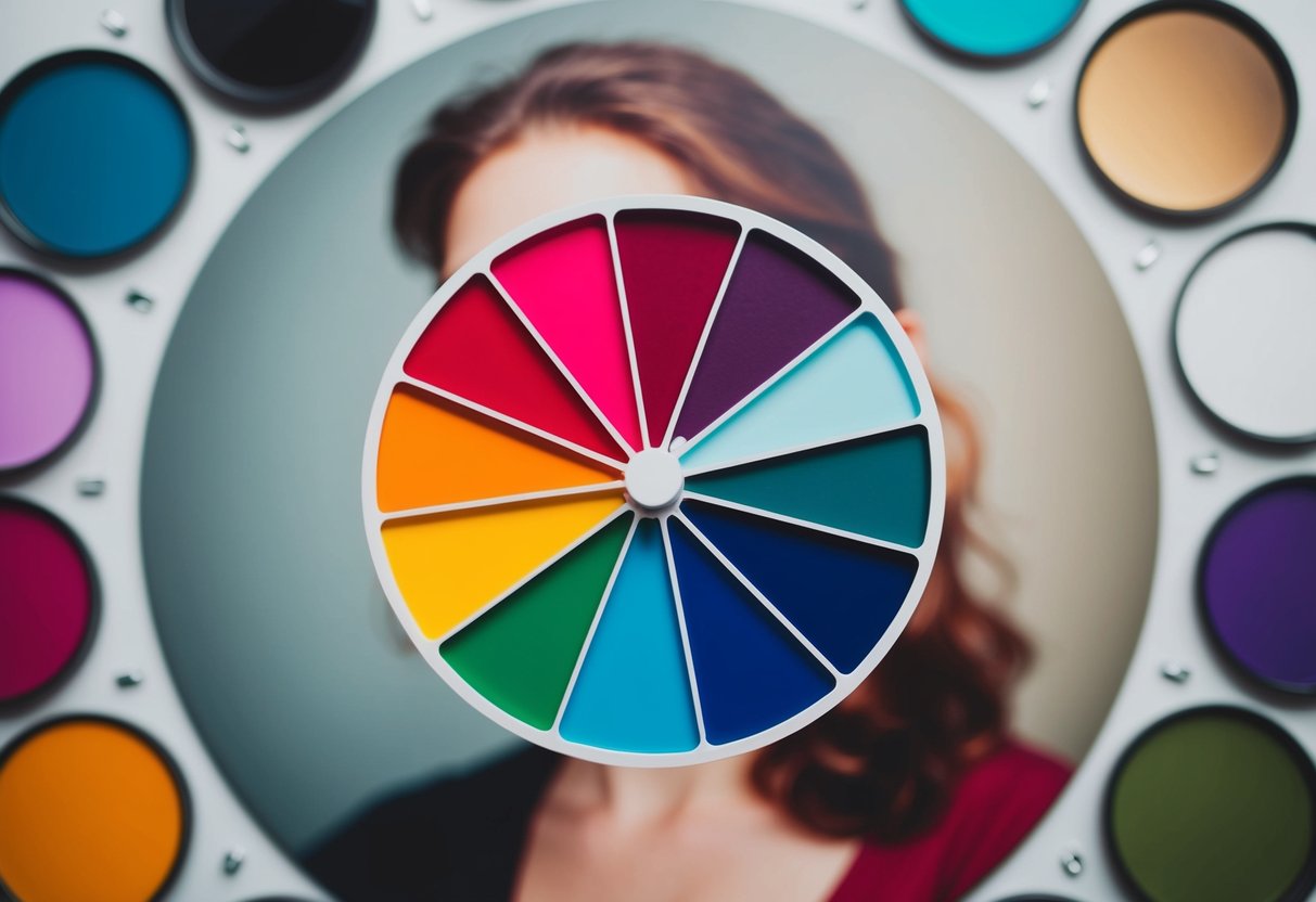
Selecting the right color scheme is essential in portrait painting. Analogous colors provide harmony, while triadic and split-complementary schemes offer vibrant contrast without being overwhelming.
Analogous Color Schemes
Analogous color schemes use colors that are next to each other on the color wheel. This proximity creates a sense of harmony and unity, making it perfect for portraits where a calm and cohesive look is desired. These schemes tend to evoke specific moods, often depending on the primary hue chosen. For instance, using blues and greens can instill tranquility, while reds and oranges can add warmth and vitality.
In portrait settings, analogous schemes can highlight specific features without detracting from the overall focus. By choosing a dominant hue and pairing it with its neighbors, artists can guide the viewer’s eye effectively. This strategy encourages a softer transition between colors, helping capture the subtle nuances in skin tones and facial expressions. Using analogous colors creates a soothing visual journey, making it suitable for more intimate and personal portraits.
Triadic and Split-Complementary Schemes
Triadic color schemes involve three evenly spaced hues on the color wheel. They provide vibrant contrast and are often used to create a lively and dynamic look. In portraits, these schemes can draw attention to specific elements without sacrificing balance. The contrast ensures that features like eyes or accessories stand out vividly.
Split-complementary schemes offer another level of complexity, utilizing a base color and its two adjacent complements. This approach maintains the contrast of complementary schemes but softens harshness, making it more versatile. In portraits, split-complementary choices can create a focal point, emphasizing certain areas while maintaining harmony. Artists exploring triadic or split-complementary schemes should consider the interaction between colors to achieve a striking yet balanced composition.